

Douglas Tires
Douglas Tires, a line sold exclusively at Walmart, was seeking an updated logo design for their brand. I created a fresh, timely look that preserved brand awareness. I chose the font Glodok, a sturdy serif that would read easily on the sidewall of a tire, and a warm, vibrant refresh of their existing red that allowed for the perfect balance of drawing the eye while maintaining their brand recognition.
Bata Shoe Museum
The Bata Shoe Museum started as a personal collection of over 1,500 shoes curated by its founder, Sonja Bata. My goal was to unite the old and the new in a visual style as eclectic as its collection. I infused sepia tones with bold neons for a unique visual style, created a modular navigation that allowed for a simple user experience, and the ability to update events and exhibitions with ease.
Freakshow Horror Film Festival
The Freakshow Horror Film Festival is an indie horror film festival in Orlando, Florida. For their tenth anniversary, I wanted to create something that would rival the most prestige film festivals in the world, without losing the creep factor. From the unbalanced typography to the laurel leaves that stare back at you, I designed a clean, modern visual system that always left you with that same eerie feeling you get from a good horror movie; that something isn't quite right.
Marathon Petroleum
My challenge designing a logo for Marathon was creating something that differentiated it from other brands in the petroleum industry and was easy to translate across a breadth of visual mediums, while maintaining the legitimacy of a well-established brand. I made the decidedly unique, but thoughtful choice of using the iconic shape of the oil derrick, paired with a color story that distinctly set them apart from their competitors.
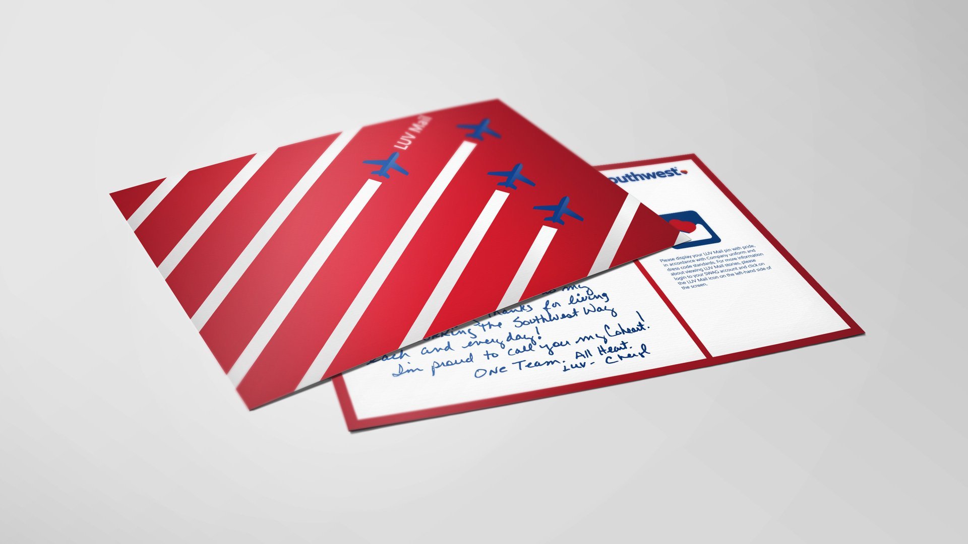
LUV Mail
Once a month, a Southwest Airlines employee would be recognized for their acts of loving kindness on the job, and given a custom LUV mail pin to wear with pride. I was tasked with creating a postcard that aligned with their newly-updated brand style, and made the recognition a little more special for the recipient.
LUV Lines
LUV Lines is an internal magazine showcasing the comings and goings of Southwest employees, circulated across the national network. Every month, an employee would share their travel stories, including tips and recommendations for those planning to visit the same destination. For this edition, I designed a spread for the colorful, coastal capital of Portugal, with a sloping layout that mimicked the hilly streets and lush, bright typography that complimented the iconic historical architecture.

TradeMark Electric
TradeMark, a commercial electric contracting company based in Fort Worth, Texas, was seeking an update to their logo after over two decades of business. I wanted to created something that would allow them to preserve brand recognition with their customers, so I designed a sleek, modern take on their existing logo, with versions that would translate easily across mediums big and small, from their website and email signatures, to black and white invoices, uniforms and truck wraps.